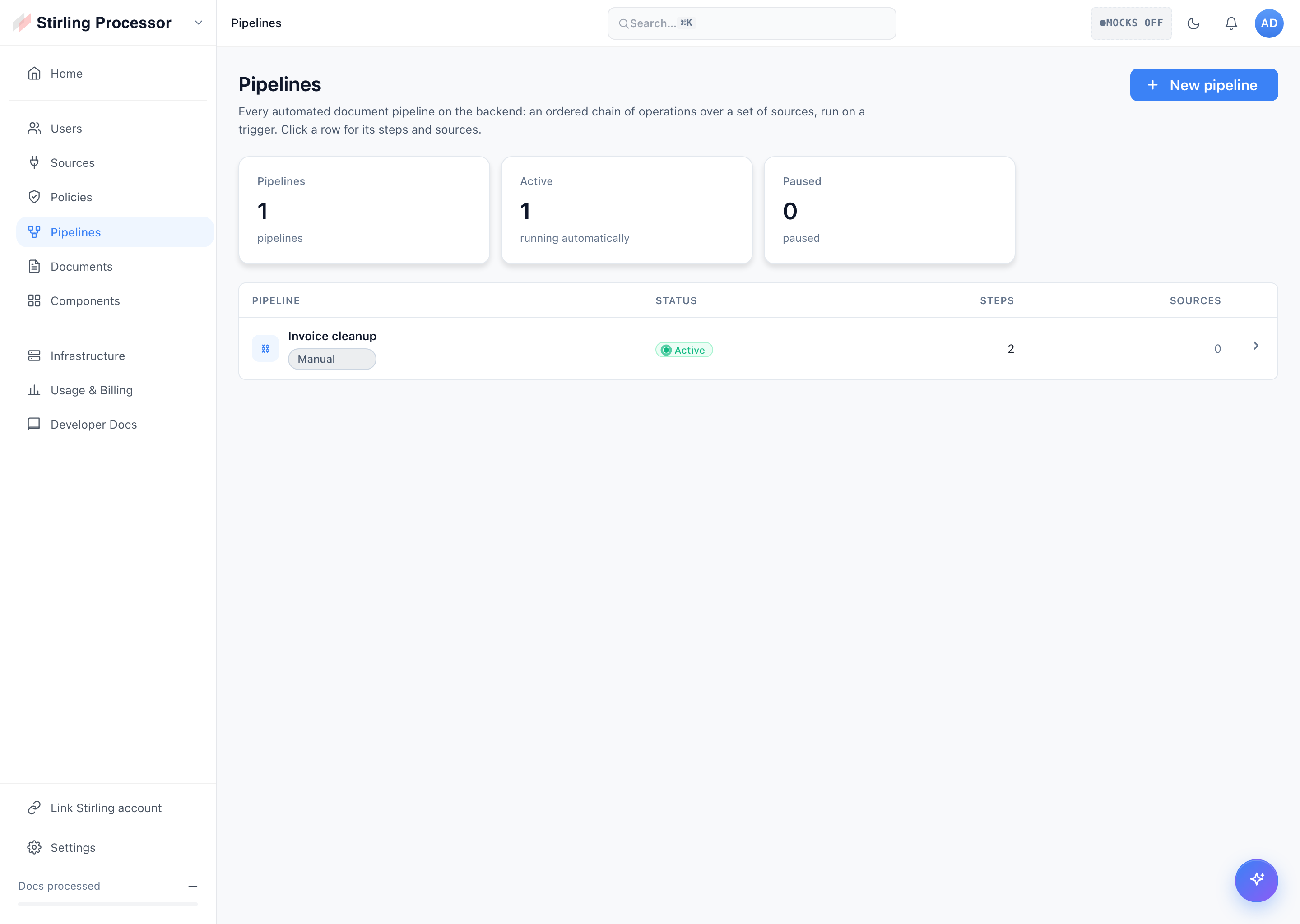
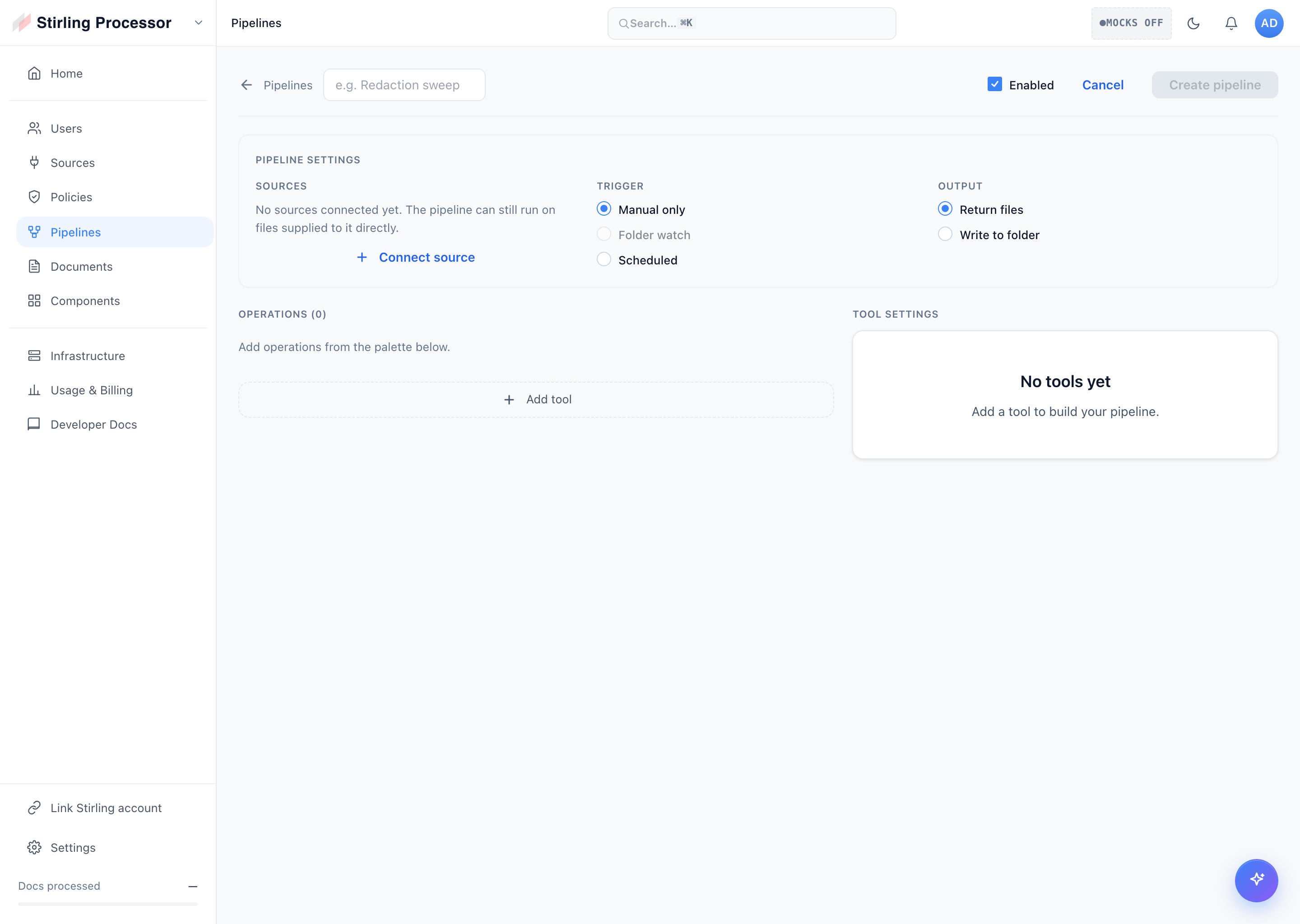
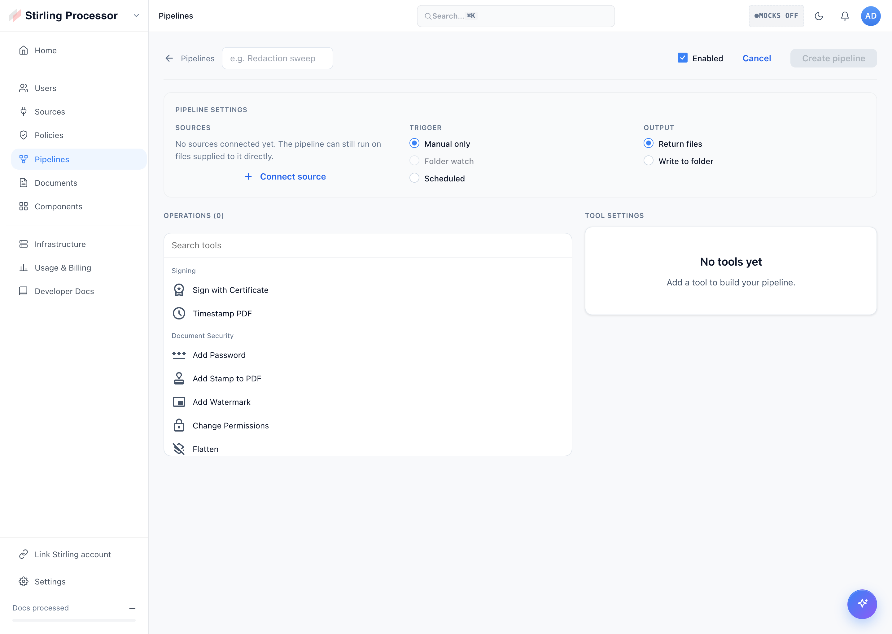
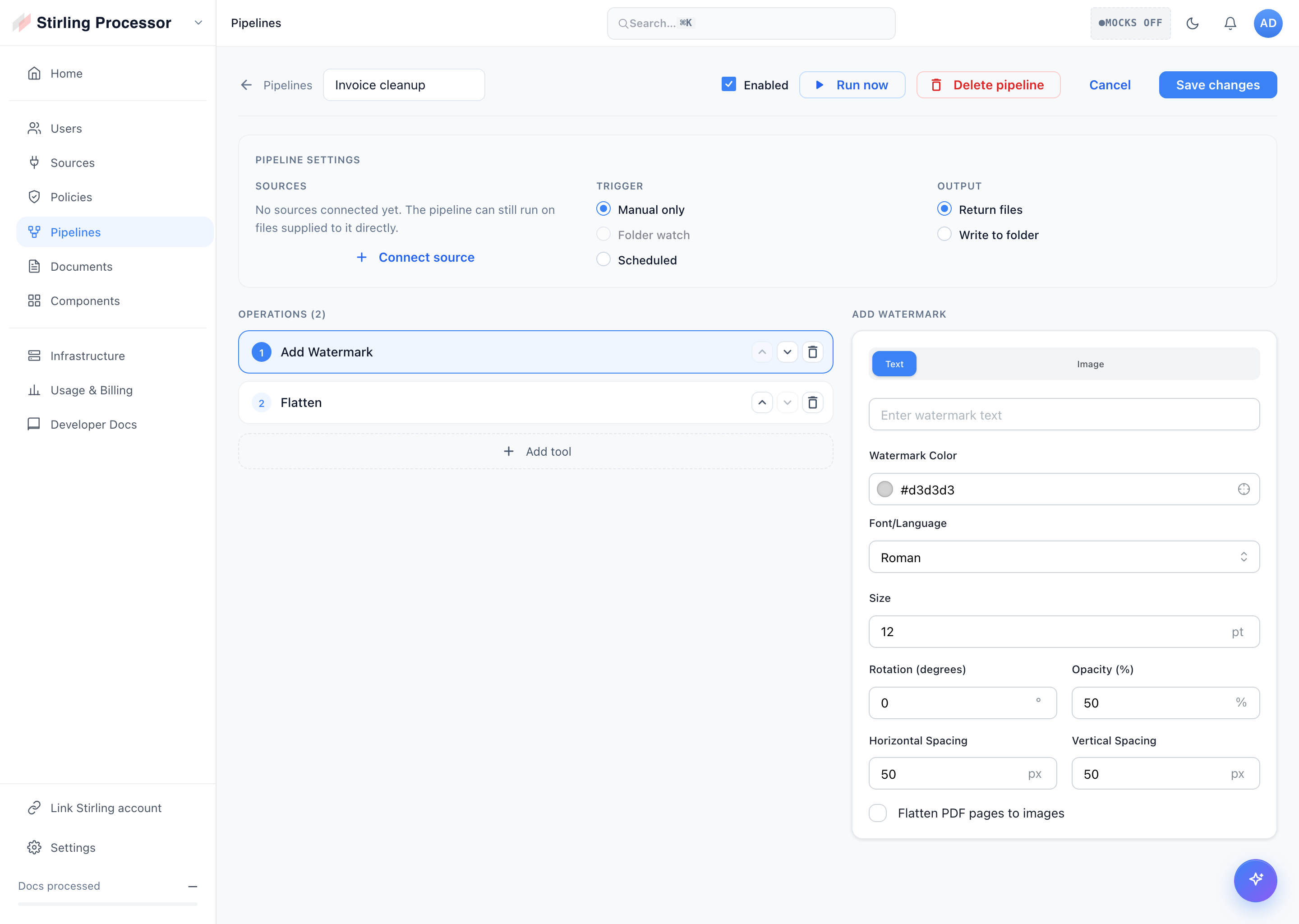
Per review on #7009: the contrast check was warn-only and opt-in, so it would
never catch regressions. Enforce it here (the follow-up PR):
- theme-lint.mjs `contrast` mode now exits non-zero on any sub-floor pair
- wired into `task frontend:lint:colors` (runs in the blocking lint gate)
- fixed the two failing pairs: --c-text-subtle on dark/portal-dark surfaces
  (3.36/3.67 → 4.74/5.18) by adding --p-zinc-250 and pointing dark subtle at it

All text-on-surface / on-primary pairs now clear WCAG AA per theme.
Add a blocking 'code-colors' mode to theme-lint: default-deny with layered
exemptions (structural; var()/readColor/canvas/pdf-lib contexts; a
// theme-allow-color opt-out; exempt paths for rendering/vendor/config/
illustration areas). File list from 'git ls-files' (no directory walk).
Wired into 'task frontend:lint:colors'; README + script header updated.

Also removes the temporary color-migration-audit.md scratch file.
Add a blocking 'css-colors' mode to theme-lint that flags any hardcoded
colour in source .css under editor/src (primitives.css + generated
output.css exempt). File list is sourced from 'git ls-files' rather than a
directory walk, so there's no readdir→readFile path; comments and structural
black/white/transparent are ignored. Wired into 'task frontend:lint:colors'.

Update theme README + script header for the expanded palette and the now
app-wide enforcement.
Merge only ADJACENT rules (consecutive, whitespace-only gap, same nesting) with
identical declaration blocks — cascade-safe (non-adjacent merges can reorder the
cascade, so left alone). 22 merges across 14 files, net -104 lines. Build +
theme-lint green.
Adds --c-warning (amber, per-theme) and --c-success/danger/warning-subtle
(pale status surfaces) to colors.css — the recurring tokens the consolidation
agents flagged as missing. Migrates the auth error/success alert boxes onto
them. Remaining status-colour consumers tracked in color-migration-audit.md.
Six parallel passes across component CSS: collapsed manual light/dark override
blocks to the adaptive --c-* tokens (navy overrides → neutral surfaces, per the
neutral-dark direction), migrated semantic colours to --c-*, stripped dead
--c-*/--p-* fallbacks, removed a duplicate ruleset. Brand/data-viz/illustration
colours kept and catalogued in color-migration-audit.md with the --c-* tokens
still needed to finish. Build + theme-lint green.
Removes the dead #6366f1 fallback from var(--c-primary, #6366f1) in 4 files
(--c-primary is always defined). Partial progress on the colour consolidation;
the full override-collapse pass is pending (agent fan-out blocked).
Auto-replaced 48 hardcoded hex colours that match a primitive within Δ≤2
(visually identical) with var(--p-*), across all component CSS. Generated
color-migration-audit.md listing the 50 near-matches and 93 genuinely-unique
colours for the follow-up agent consolidation pass. Build + theme-lint green.
- theme.css: convert the 5 hardcoded UI colours that exactly match a primitive
  to var(--p-*) / color-mix(var(--p-*)); bespoke logo/illustration fills, brand
  azure/gradients and the deliberate flash-yellow have no primitive equivalent
  and are left.
- Remove 11 verified-dead legacy tokens (--text-always-*, --landing-drop-*,
  --link-*) — 0 refs and not built dynamically (excluded all --color-*/--accent-*
  since those prefixes ARE constructed at runtime). theme.css 902 → 865 lines.
Build + theme-lint green.
Migrated all remaining legacy-alias consumers (incl. stories/tests) to --c-*
(199 refs / 58 files), promoted the computed aliases to first-class tokens
(--c-accent-fg made universal on :root; --c-primary-tint / --c-primary-border
added), then removed compat.css, its @import, and its linter entry. No legacy
colour-alias layer remains; build + theme-lint green.

The larger theme.css/tokens.css legacy definition files are a separate cleanup.
After migrating consumers to --c-* (prior commit), 71 of the 93 1:1 compat
aliases have zero references anywhere (verified across src + tailwind.config +
index.html; the 22 that remain are kept alive by stories/portal mantine theme).
Removing the dead ones cuts compat.css roughly in half — the real consolidation
payoff, not just a rename.
Per-area passes replaced hardcoded surface/text/border/status hex in component
stylesheets with semantic --c-* tokens (--p-* only where an exact value had to
be preserved). Left intentionally: structural black/white/transparent, OAuth
brand colours, deliberate multi-hue gradients, data-viz/status hues without a
semantic fit, and dead var(--c-*, #fallback) fallbacks. ~90 sites across 17
files. Build + theme-lint green.
Codemod (editor/scripts/migrate-compat-colors.mjs) rewrites every var(--legacy)
reference to the canonical --c-* token it maps to in compat.css (1:1 aliases
only; computed color-mix/fallback aliases left in place). 218 files, 1947
references. Pure rename — compat.css already guarantees each alias equals its
--c-* target, so no behaviour change.
Collapse the two #3b82f6 occurrences (DEFAULT_ACCENT_COLOR + first preset) into
a single documented BLUE_500 const. The accent hexes stay JS literals by
necessity — stored verbatim and parsed by deriveAccessiblePrimary, so CSS
var(--p-*) refs can't be used; theme-lint scopes to CSS only.
Dark mode's darkest surface (--c-bg / --p-zinc-950) read as near-black. Lift
it ~2% lighter across every representation (primitive, Tailwind --gray-50/
--background channels, Mantine dark-7) so the canvas is a deep charcoal, never
pure black — consistent, not a one-off override.
# Description of Changes
Policies can currently throw when calling redact:

<img width="1186" height="824" alt="image"
src="https://github.com/user-attachments/assets/bdcc09fe-5bf4-4b0a-b119-bcc33c98c7f2"
/>

Policies really need to be updated to properly make use of the new
bidirectional mappings for this, but this will hopefully fix it for now.
The external-link "Developer Tools" buttons (API, Automated Folder
Scanning, SSO Guide, Air-gapped Setup) used `p="sm"` while normal tool
buttons use `p="none"`, making them render larger; this aligns their
padding so they match the size of every other tool button.

<img width="308" height="196" alt="Screenshot 2026-07-10 at 5 01 40 PM"
src="https://github.com/user-attachments/assets/fb125500-28fb-4b83-85ed-2edc12e66fc0"
/>
## What

Removes the policy **management** surface from the editor's right rail —
the Policies list above Tools, the open-policy detail takeover, and the
collapsed-rail policy icons — along with the whole UI tree only they
used: the setup wizard and its tool-config steps (PII / redact /
watermark), the detail panel, delete modal, selection store,
enforcement-queue status chip, activity/stats derivation, the catalog
hook, their i18n keys, dead types, and the admin-gate spec that tested
the wizard flow.

**Enforcement is untouched.** Auto-run on upload, the viewer blocking
overlay, exit-point blocking, file badges, and export-time enforcement
all stay. `usePoliciesEnabled` moves to its own module (core stub /
proprietary / desktop shadow with the SaaS-connection check) since it
still gates mounting the headless `PolicyAutoRunController` from the
rail.

## Why

Policies are configured in the admin portal now
(`src/portal/views/Policies.tsx`). Keeping a second management UI in the
editor rail meant two surfaces to maintain for one feature; the editor
only needs to *enforce*.

## Notes for review

- The rail UI lived in the shared `core` `RightSidebar`, so this removes
it from every build flavour at once; the deleted `PoliciesSidebar`
module existed at the core (stub) / proprietary / desktop alias layers
and all three are gone.
- Every deleted module was verified to have zero remaining importers;
near-misses that stay: `enforcementQueue` (used by export enforcement),
`poll` (test-imported), `usePolicies` (used by auto-run).
- Net −3,900 lines.

## Testing

- `task frontend:check` green: typecheck, ESLint + dpdm, Prettier, all
1,196 tests.
- All build-variant typechecks pass (core / proprietary / saas /
desktop).
## Summary

A batch of shared **design-system** fixes (Button, SegmentedControl,
Chip, a new CarouselDots) and the consumer/call-site cleanups they
unlock, following the button consolidation (#6787). Also includes
dark-theme token alignment and some portal/auth polish that rides on the
same components.

The shared Button now sizes to its content instead of clipping it, gains
per-axis padding controls, and no longer misbehaves while loading or
disabled; several call sites are then migrated onto the proper component
APIs.

## Shared components (`core/ui`)

### Button
- **Content-driven height.** `--button-height` is now a `min-height`,
not a fixed cap. Single-line buttons still land exactly on the shared
control-height scale (pixel-aligned with `ActionIcon` /
`SegmentedControl`), while taller content — wrapped labels, stacked
title + subtitle rows — grows the button instead of being clipped
mid-glyph. Short content is re-centered with `align-content`,
**without** overriding the root `display`, so a consumer's own layout
(e.g. a full-width list row) isn't disturbed.
- **Padding props.** New `p` / `px` / `py` props
(`none`/`xs`/`sm`/`md`/`lg`/`xl`) override the size-based padding per
axis. Vertical padding is applied through a `--sui-btn-py` CSS variable,
so consumers can also set it from their own class.
- **Loading no longer collapses.** A `fullWidth` button is never treated
as icon-only, so an execute button whose label is momentarily absent
while files hydrate (e.g. `ScopedOperationButton`) keeps its full width
with a centered spinner instead of shrinking to an icon-sized square for
a split second.
- **Disabled in dark mode.** A disabled *primary* button keeps a muted
version of its own accent fill (`opacity: 0.55`) instead of Mantine's
near-black `--mantine-color-disabled`, which blended into dark surfaces
and made the button all but disappear. Loading spinners are excluded so
they stay full-strength.

No breaking API changes — buttons that don't opt in render exactly as
before.

### SegmentedControl
- Fixed a bug where a segment marked `disabled` that also happened to be
the currently-selected value was rendered disabled, leaving the active
segment un-selectable/greyed. A disabled option is now only disabled
when it isn't the current value.

### CarouselDots (new)
- New shared dots indicator component (with Storybook story), used by
the login carousel.

### Chip / theme
- Dark-theme tokens in `theme.css` aligned to the portal's `tokens.css`
so the editor and portal (Processor) dark modes stop drifting (chrome
surfaces lift off the darker canvas); plus a Chip dark-mode styling fix
and a small `mantineTheme` cleanup.

## Consumer / call-site cleanups

- **Compare** tool: the swap control is now a regular shared Button
placed **between** the Original and Edited file cards (the bespoke
full-height vertical swap button and its CSS were removed), and the file
cards fill the full available width.
- **Certificate format**: replaced the inline-styled buttons with clean
two-state (primary / secondary) buttons.
- **ToolPicker**: restored the label selectors that #6787 renamed to the
never-emitted `.sui-btn__label`, and fixed the sidebar-search row
clipping.
- **File sidebar**: "View all files" row fix; `FileSidebarFileItem`
migrated off `display:flex` + `gap` on the Button root (which no longer
reaches the nested label) onto `leftSection` / `rightSection` + a
stacked label.

## Portal / auth polish

- Portal button consolidation and styling across Header, SettingsModal,
Home, Infrastructure, ApiKeyCard, and PopularUseCases.
- **Login**: onboarding text now shows the default starting username /
password; login carousel uses the new CarouselDots; desktop OAuth
styling tweak.

## Verification

- Storybook: button sizes measure exactly on the control-height scale
and match `ActionIcon`; icon-only buttons stay square and centered;
`fullWidth` loading buttons hold full width; disabled dark-mode primary
buttons render as a muted accent rather than grey.
- Single-line buttons are pixel-identical before/after; only buttons
whose content previously overflowed a fixed height render differently
(they now fit rather than clip).
- `task frontend:lint` clean; typecheck shows only the pre-existing
third-party `node_modules` noise also present on `main`.
## What this does

Reworks the portal's policy setup screens so a policy reads as **its own
settings**
rather than a list of tools you wire together, and rebuilds the forms on
the
shared design system so they match the rest of the portal.

## Why

Setup showed one card per underlying tool (tool name + a toggle), which
exposed
the "a policy is a pipeline of tools" plumbing. A policy should read in
terms of
what it does to a document, not which tools run under the hood.

## Changes

- **Setup reads as policy settings.** The per-tool cards are now a
plain-language
list of what the policy does — "Redact sensitive information", "Strip
active
content", "Apply a watermark", and so on — each with a short description
and a
  toggle, with its options appearing inline when turned on.
- **Consistent design system.** The setup and edit forms use the shared
  components instead of one-off styling.
- **Simpler setup.** Removed two sections that aren't part of what ships
here:
  Document Types (scope-by-type) and Retries.
- **Watermarks are text-only.** A policy watermark is a text stamp, so
the image
  option and the type picker are hidden.
- **The editor always shows as a source** (it used to disappear when no
other
  sources were connected), and the source tiles now lay out correctly.
- **Clearer upsell copy.** Locked policies read **"Upgrade to
Enterprise"**
  instead of "Coming soon".

## Scope

UI only — no backend changes. Keeping a policy's settings in sync
between the
portal and the editor is a known, separate issue and is **not** part of
this PR.

## Testing

Prettier, ESLint, typecheck (proprietary + saas), and the
unused-translation
guard all pass. Setup screens verified in Storybook.
The portal's `SettingsModal` was a parallel, mock-backed settings
implementation. It's replaced by the editor's `AppConfigModal`, mounted
via a new `PortalSettingsHost` that supplies the contexts the portal
doesn't have (app config, flavor-resolved session, preferences, editor
theme). Flavor resolution does the rest: the self-hosted portal gets the
admin sections, the SaaS portal gets the saas shell. The self-hosted
account-link panel rides in through the existing seam as an extra
section.

The shell gains three host props (`urlSync`, `initialSection`,
`extraSections`); editor behaviour is unchanged. Net −1,300 lines.

Manually verified on both flavors against live backends.
The portal no longer uses mock data — it always talks to the real
backend. Mocks still power Storybook and tests.

- Mocks button and all the in-app MSW machinery removed.
- Types the app needs moved out of mock files and into the api layer, so
the app no longer depends on `mocks/` at all.
- One deliberate exception for the onboarding tour (#6926):
`enablePortalDemoData()` fills the views with example data while a tour
runs, with zero cost the rest of the time.

Heads up: views without a real backend endpoint yet now show empty/error
states in dev.
## What this changes

Moves the admin portal's browser route from **`/portal`** to
**`/processor`**, to match the "Processor" product name (the in-app app
switcher already says "processor").

- `PORTAL_BASENAME` `"/portal"` → `"/processor"` — the single source of
truth for all portal paths on the frontend, so every `toPortalPath(...)`
link and redirect follows automatically.
- `adminRouteExtensions` now mounts at `` `${PORTAL_BASENAME}/*` ``
instead of a hardcoded `"/portal/*"`, so the route can't drift from the
constant.
- **Backend:** `RequestUriUtils.isStaticResource` now treats
`/processor` (not `/portal`) as the SPA shell, so a direct navigation or
hard refresh to `/processor` serves the app instead of 404ing. (This is
the only backend URL reference — there's no Spring Security matcher for
it.)
- Updated the two portal route tests and the doc comments that named the
old path.

**Not changed:** the `@portal/*` import alias — that's the code layer /
flavor-layering path, not the URL. Renaming it would be a much larger,
unrelated churn.

The portal isn't publicly launched yet, so there are no existing links
to preserve — no redirect from the old path is included.

## Testing
- `task frontend:typecheck:all`, full test suite (1,211), lint, format —
green
- `./gradlew :common:test --tests "*RequestUriUtilsTest"` — green
## Overview

Adds **AI document classification** and a **classification-aware Files
sidebar**: uploaded documents are automatically tagged with
document-type labels (Invoice, Contract, Lab report, …), and the sidebar
groups files under editable parent categories so a large library stays
navigable.

> [!IMPORTANT]
> **This feature only runs in the SaaS build.** Classification depends
on the AI engine and team-scoped label storage, so it's gated to SaaS
end-to-end:
> - The sidebar grouping is a `saas/`-layer override of the
`fileSidebarGrouping` seam; every other build (OSS core, self-hosted
proprietary, desktop) gets the null stub and renders the **unchanged
flat, recency-sorted list** — no categories, no "Other", no picker.
> - The classify/labels backend endpoints are gated on
`policies.enabled` (on in SaaS) and live in `app/proprietary`, so
they're absent from pure OSS and dormant in self-hosted unless
explicitly enabled.
> - The Python classifier is reached only via that gated path.
>
> Shared-layer changes that do compile everywhere are inert without the
engine (dormant schema/field additions) or intentional (`GetInfoOnPDF`
surfacing custom metadata).

## What it does

- **Classifier (engine):** reads the first/last two pages of a PDF and
assigns document-type labels from an allowed vocabulary. Labels are
deliberately document-*type* descriptors — no deep-content/PII
detection, since only a page window is read.
- **Team label vocabulary:** ~270 built-in defaults across ~15 families,
seeded per team. Editable by team leaders/admins in the Classification
policy settings (import/export/reset). Team-scoped and shared;
**per-user personal labels are intentionally out of scope** — the
vocabulary is team-level only.
- **Sidebar categories:** files group under parent categories
(Financial, Legal, Medical, …), busiest-first, collapsible, with a
"Recent" group on top and an "Other" group for anything uncategorised.
The category structure (names, icons, membership, custom categories) is
**device-local and user-editable** via a "Customize" picker — the only
per-user personalization; it never changes the team's label vocabulary.
- Classification results are written to PDF metadata
(`StirlingPDFClassification`), read back to keep files in their groups
without re-parsing.

## Architecture

Spans all three layers, mirroring the existing policy/source subsystem
conventions:
- **`frontend/editor`** — sidebar grouping seam + SaaS override,
category manager, labels editor, icon palette, file grouping, tests,
`en-US` i18n.
- **`app/proprietary` + `app/common` + `app/core`** —
`ClassifyLabelController`, team-scoped `ClassificationLabelStore` (Jpa +
in-process impls, same shape as `PolicyStore`/`SourceStore`), metadata
read/write.
- **`engine`** — the document-classifier agent, contracts, routes,
tests.

## Screenshots

**Files sidebar — grouped by category (SaaS)**

### Loading view

<img width="2056" height="1046" alt="Screenshot 2026-07-07 at 5 12
56 PM"
src="https://github.com/user-attachments/assets/1d712da5-50ae-4349-b0cd-e62665c3ec0c"
/>

### Organized in the sidebar

<img width="2056" height="1045" alt="Screenshot 2026-07-07 at 5 14
05 PM"
src="https://github.com/user-attachments/assets/3ea4fe21-da51-4cea-bc3a-18ce040d3d05"
/>

**Customize categories picker**
### Personal settings to change how labels are grouped in an individual
users editor

<img width="2056" height="1044" alt="Screenshot 2026-07-07 at 5 52
42 PM"
src="https://github.com/user-attachments/assets/40be03ce-0f63-4d1e-b58b-cec045d01cb2"
/>

**Classification labels editor (team settings)**

<img width="2056" height="1042" alt="Screenshot 2026-07-07 at 5 53
00 PM"
src="https://github.com/user-attachments/assets/337b0739-15c9-4749-9c6b-22e3b20825b8"
/>

## Testing

- Frontend `task frontend:check` — green (editor + portal tests,
typecheck across all flavors, lint, label-drift guard).
- Backend `task backend:check` (proprietary) and `:saas:test` — green.
- Engine `task engine:check` — green.
## What
Adds a **Storybook preview** for PRs. When a PR changes any story
(`*.stories.{ts,tsx,mdx}`) or the `.storybook` config, this builds the
static Storybook, deploys it to the preview VPS on a PR-scoped port, and
comments with the URL plus an **expandable list of exactly which stories
changed**. Torn down automatically when the PR closes.
New file: `.github/workflows/storybook-preview.yml`. Nothing else is
touched.
## How
- **Detect** (`changes` job) - `dorny/paths-filter` with `list-files:
json` flags Storybook changes and captures the exact changed files.
Skipped on close and for fork PRs (which don't get the VPS secrets).
- **Deploy** (`deploy` job, only when Storybook changed) - builds the
static Storybook (`task frontend:prepare` + `frontend:storybook:build`),
tars it, and serves it from an `nginx:alpine` container on the VPS at
port `PR# + 20000` (offset from the app preview's bare-PR-number port to
avoid collisions). Mirrors `PR-Auto-Deploy-V2.yml`'s VPS SSH pattern and
reuses the same secrets.
- **Comment** - a single bot comment (replaced on each push) with the
preview URL and a `<details>` block listing the changed stories (and any
`.storybook` config changes), e.g.:
> ## 📚 Storybook preview
> 🔗 **Preview:** http://<vps>:26911
> <details><summary>2 stories changed (+1 config
file)</summary>…</details>
- **Cleanup** (`cleanup` job, on PR close) - stops the container,
removes the files, and deletes the comment.
## Validation
- Static Storybook builds locally (`task frontend:storybook:build` →
`frontend/storybook-static`, 151 stories).
- Confirmed `task frontend:prepare` regenerates the un-committed
`material-symbols-icons.json` that stories import, so a fresh CI
checkout builds (added it before the build step).
- Comment-markdown logic unit-checked against a sample changed-files
list.
- YAML validated; action pins match the repo (`setup-node` v6.4.0 / node
22, same `paths-filter`, `setup-bot`, `harden-runner`).
## Note
The VPS deploy mirrors the proven `PR-Auto-Deploy-V2` machinery but
couldn't be exercised end-to-end from a dev box (needs the VPS secrets)
- the first live run on a Storybook-touching PR will confirm the
deploy/serve/cleanup path. Everything build- and comment-side is
validated locally.
2026-07-09 10:51:45 +00:00
Anthony StirlingGitHubaikido-pr-checks[bot] <169896070+aikido-pr-checks[bot]@users.noreply.github.com>
# Description of Changes

Portal access control + user management
What this does

- Adds server-side portal access enforcement: a ResourceGrant ACL (owner
→ admin → grant → default policy) gates the portal via
@resourceAccess.canUsePortal(), so access is authoritative on the
backend, not just hidden in the UI.
- New proprietary/access module: ResourceAccessService +
ResourceAccessSecurity, PrincipalResolver (default + SaaS + team-lead
lookup), OwnershipService, ResourceGrantController, and a SecretMasker
for safe config display.
- Exposes an authoritative portalAccess flag on /me (AuthController /
AdminUserSummary); drops the old org-principal shortcut.
- Full portal Users page: team + member management (members table,
invite, move-to-team, new/rename team, reset password, access controls,
confirm modals) wired to real user/team/grant endpoints.
- Per-flavor capabilities seam (usersCapabilities): self-hosted
org-admin gets everything; SaaS is trimmed to what a team leader can do
(no ROLE_ADMIN ever surfaced).


SaaS blockers (separate follow-up PR)
The portal Users page works on self-hosted but 403s on SaaS (it calls
the admin API hasRole('ADMIN'), and SaaS users are ROLE_USER). To ship
the portal on SaaS:

- Add a @app/portal/usersBackend seam and point the SaaS build at the
existing SaasTeamController (no new backend).
- Resolve the leader's team-id on SaaS and map member/invitation shapes
to the portal Member type.
- Add pending-invitation management (list + cancel) - the parity gap vs
the editor.
- Re-enable the roster remove action on SaaS against
SaasTeamController's remove-member endpoint.


<img width="1426" height="464" alt="image"
src="https://github.com/user-attachments/assets/7a441a35-7a57-472f-a8c7-e6d8ae998439"
/>

<img width="492" height="722" alt="image"
src="https://github.com/user-attachments/assets/d4e8a088-b2eb-4326-9e00-7ada6eb72a85"
/>

---

## Checklist

### General

- [ ] I have read the [Contribution
Guidelines](https://github.com/Stirling-Tools/Stirling-PDF/blob/main/CONTRIBUTING.md)
- [ ] I have read the [Stirling-PDF Developer
Guide](https://github.com/Stirling-Tools/Stirling-PDF/blob/main/DeveloperGuide.md)
(if applicable)
- [ ] I have read the [How to add new languages to
Stirling-PDF](https://github.com/Stirling-Tools/Stirling-PDF/blob/main/devGuide/HowToAddNewLanguage.md)
(if applicable)
- [ ] I have performed a self-review of my own code
- [ ] My changes generate no new warnings

### Documentation

- [ ] I have updated relevant docs on [Stirling-PDF's doc
repo](https://github.com/Stirling-Tools/Stirling-Tools.github.io/blob/main/docs/)
(if functionality has heavily changed)
- [ ] I have read the section [Add New Translation
Tags](https://github.com/Stirling-Tools/Stirling-PDF/blob/main/devGuide/HowToAddNewLanguage.md#add-new-translation-tags)
(for new translation tags only)

### Translations (if applicable)

- [ ] I ran
[`scripts/counter_translation.py`](https://github.com/Stirling-Tools/Stirling-PDF/blob/main/docs/counter_translation.md)

### UI Changes (if applicable)

- [ ] Screenshots or videos demonstrating the UI changes are attached
(e.g., as comments or direct attachments in the PR)

### Testing (if applicable)

- [ ] I have run `task check` to verify linters, typechecks, and tests
pass
- [ ] I have tested my changes locally. Refer to the [Testing
Guide](https://github.com/Stirling-Tools/Stirling-PDF/blob/main/DeveloperGuide.md#7-testing)
for more details.

---------

Co-authored-by: aikido-pr-checks[bot] <169896070+aikido-pr-checks[bot]@users.noreply.github.com>
## What

While a per-file policy run is in flight, the editor now blocks every
way the file can leave the app, and shows why:

- **Viewer** — a blocking overlay with live progress ("Enforcing
policy…"). Dismissible: collapses to a corner badge (top right, tinted
with the policy's accent) so the file stays readable while the run
finishes.
- **Workbench bar** — Print / Download / Save As / Share are disabled
with an explanatory tooltip and progress bar. The Ctrl+P shortcut and
the form-fill bar's "Download PDF" button are covered too.
- **File lists** — the file sidebar, file-editor thumbnails, and files
page show a spinning shield badge on the affected file, and thumbnail
hover actions (download / upload to server) are blocked with the same
tooltip.

Once a run settles, everything unblocks — including FAILED and CANCELLED
runs. A failed check surfaces through the run's activity feed; it never
locks the user out of their file.

## Why

Upload-triggered policies exist so the enforced output is what leaves
the app. Before this, a file could be printed, downloaded, or shared
while its policy run was still processing.

## Also in here

- **One shared `PolicyBadges` component** — the sidebar, thumbnails, and
files page each had their own copy of the badge markup/CSS and had
drifted (different sizes, tints, missing spinner and glow on the files
page, hardcoded English tooltips). All badge surfaces now render the
same component: accent-tinted shield, spinner while enforcing, one-off
glow when recent, i18n'd tooltips.
- **Cascade fix:** outputs imported from reconciled
(server-rediscovered) runs are now tagged `derivedFromTool`, stopping an
auto-run → import → auto-run loop that produced ever-growing
`_sanitized_sanitized…` filename chains on fresh devices.
- **Core stub for `policyRunStore`** so the core build compiles —
`WorkbenchBar` and `ViewerShareButton` resolve `usePolicyRuns` via
`@app/*`.

## Testing

- `task frontend:check` green: proprietary typecheck, ESLint + dpdm,
Prettier, 915+ editor + 81 portal unit tests.
- `typecheck:core` / `saas` / `desktop` variants all pass.
- Enforcement flow exercised manually against a live backend with an
upload-triggered policy (overlay + progress during the run, dismiss to
corner badge, unblock on completion).

---------

Co-authored-by: James Brunton <jbrunton96@gmail.com>
# Description of Changes
The Change Metadata tool was missed from the bidirectional mappings
added in #6867. This PR adds it to the list of supported tools.
Adds the portal's top-left app switcher to the editor sidebar, so you
can jump between the two apps from either side.

- Both sidebars render the same shared `AppSwitch` component (sui
dropdown).
- Switching is client-side (no page reload); portal→editor no longer
breaks when `VITE_EDITOR_URL` is unset.
- Editor side is admin-gated (`portalAccess`) and only exists in flavors
that ship the portal — core/desktop stub it out, same seam pattern as
the portal routes.
- Fixes en route: dropdown menu stacking in the editor sidebar, sui
dropdown item button reset, stale `dist-portal` ESLint ignore.
# Description of Changes
Followup work requested in review of #6867. Currently, there is nothing
enforcing that the endpoint chosen in the tool config is the correct
mapping for `toApiParams`, so theoretically it's possible for a tool to
be set up to call an endpoint with the wrong API params for it. There's
also nothing currently enforcing that `toApiParams` and `fromApiParams`
are compatible with each other (using the same types). This PR changes
it so that instead of creating the config object directly, tools create
it via a generic function, which enforces that all of the relevant
mappings are using compatible types.
# Description of Changes
Modernises the codebase and gets rid of warnings where Node complains
that it doesn't know what type of JS it's supposed to be reading on
`.js` files. We might as well update everything to just use correct JS
syntax instead of keeping with some files having Node-specific imports.
 EthanHealy01